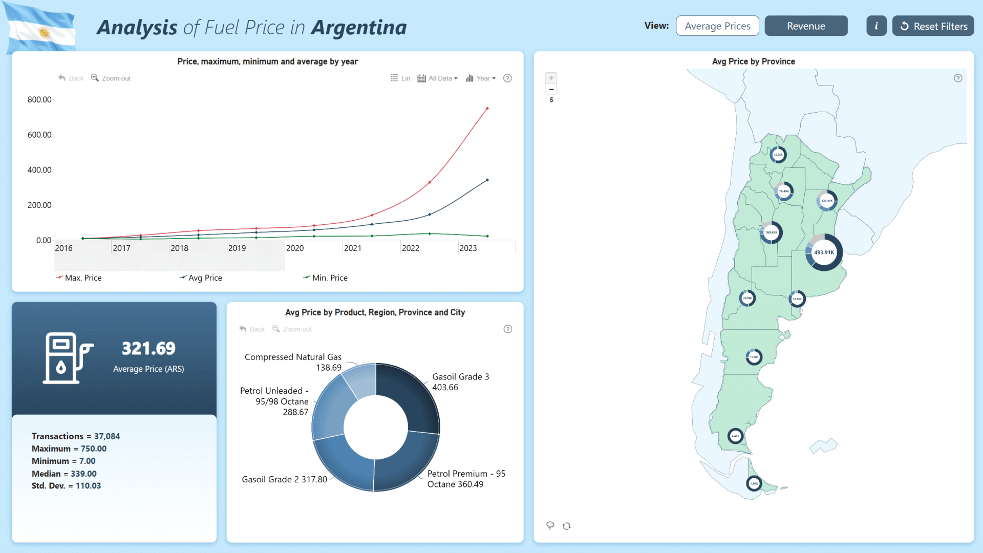
The report consists of two pages – one for the average fuel price comparison, and the other for revenue analysis. With an interactive map chart, you can see the average fuel price per province, while the timeline chart shows the changes in fuel price over time.
The second page uses multiple visuals to analyze revenue from multiple dimensions – companies, regions, and even time of day. The standout feature of this report is its interactivity, and as you select data in one chart, the other visuals will dynamically filter to show relevant insights.
How To Use This Report Template
To interact with this Power BI report, simply click any active elements directly on the charts.
Download this report to see all the settings, formulas, and calculations. Try it out with your own data by making a few adjustments.
Leave a Reply