Summary
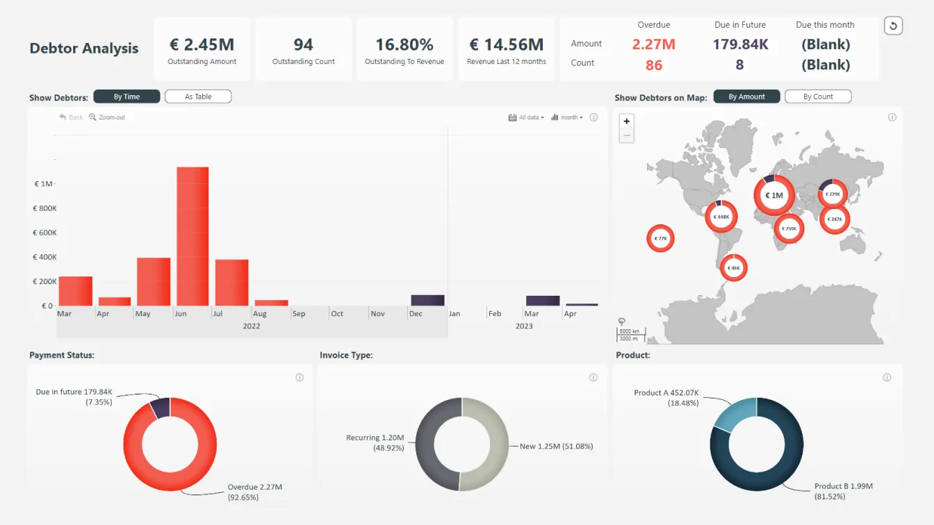
Perform a thorough debtor analysis with this clean and intuitive KPI dashboard for Power BI! The KPI cards give an insight into the total amount of outstanding and overdue payments, separating them by Count and Amount. You can also see payments that are due in the future.
The charts underneath the KPI cards give a more precise look at the outstanding debt timeline as well as their respective locations using the Drill Down TimeSeries PRO and Drill Down Map PRO custom visuals for Power BI.
Key Features
- Drill Down TimeSeries PRO lets you easily visualize time-based data.
- Drill Down Map PRO lets you create user-friendly map charts to add geographical context to data.
- Drill Down Donut PRO lets you create stunning donut charts.
- Get a quick overview with dynamic KPI cards.
- Reset button for each visual as well as the entire report.
How To Download & Use This Dashboard Design Template
To interact with this debtor analysis report, simply click any active elements directly on the charts. Download this free KPI dashboard example to see all the settings, formulas, and calculations. Try it out with your own data and customize it with the wide range of settings!
Leave a Reply